Story map
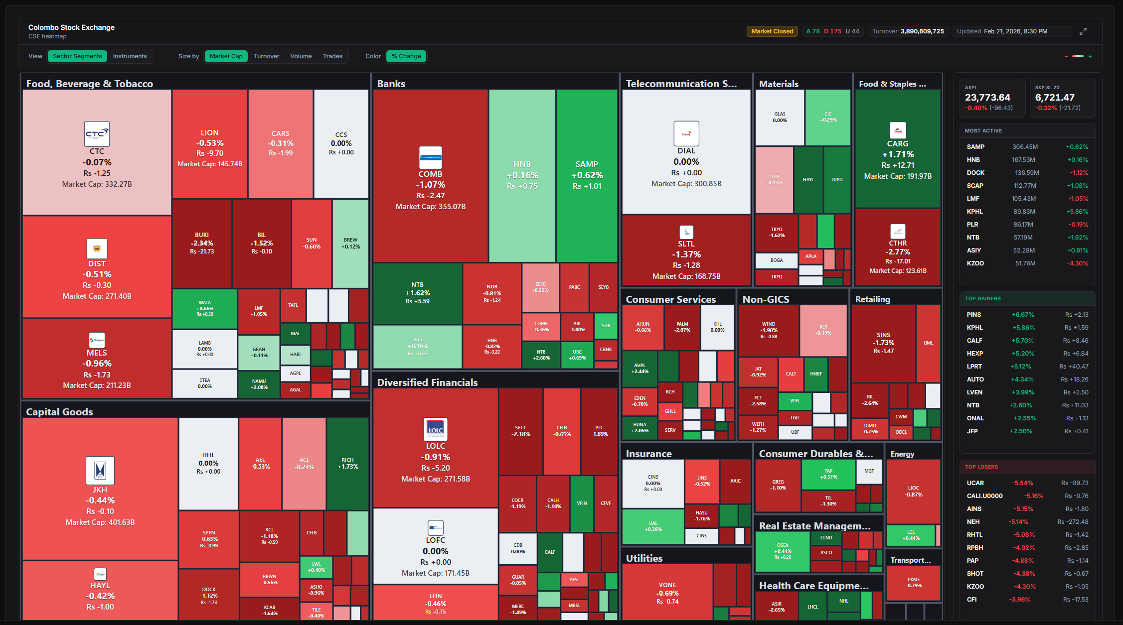
A market heatmap is a color-coded grid that shows sector performance and capital concentration across stocks or indices at a glance. Green tiles highlight gains, red shows losses, while box sizes often reflect company market value. Investors rely on this format to cut through data overload and spot trends faster than scanning spreadsheets or individual charts.
Start here
The short version
- 01A market heatmap transforms raw stock data into an intuitive visual grid using colors for performance and sizes for market weight. Investors turn to it for instant insight into sector strength and where money is concentrating. This guide explains the mechanics and practical appli
- 02A market heatmap arranges stocks or sectors into a mosaic of colored rectangles.
- 03Data feeds pull live prices from exchanges and calculate daily or intraday percentage moves.
Method, source and disclosure
This analysis is prepared by the Market Lens desk from the sources named in the story and publicly available market information. Material revisions appear in the updated timestamp.
View primary source ↗What Is a Market Heatmap?
A market heatmap arranges stocks or sectors into a mosaic of colored rectangles. Each tile updates in real time or at session close to reflect percentage price change. The visual approach draws from data-mapping techniques long used in science and business.
Platforms group holdings by sector, index membership, or custom watchlists. This creates an immediate picture of market breadth. Here is the kicker: the layout compresses hundreds of data points into one screen.
Retail and professional users alike adopted the tool as trading platforms added interactive versions in the past decade. It remains popular because it sidesteps the need to click through dozens of charts.
How Market Heatmaps Work
Data feeds pull live prices from exchanges and calculate daily or intraday percentage moves. Algorithms assign colors along a gradient—deep green for strong gains, pale green for modest rises, deep red for sharp drops. Intensity scales with magnitude.
Tile area typically scales with market capitalization, so mega-cap names dominate visually. Users can toggle views between sectors, countries, or custom groups. Why this matters is that relative size immediately flags where capital clusters.
Additional layers such as volume or volatility can replace basic performance coloring on many platforms. Filters let viewers isolate time frames from one hour to one year.
Revealing Sector Performance and Capital Trends
Clusters of green tiles within technology or energy reveal sector-wide momentum. Scattered red boxes in defensive areas highlight rotation out of those names. The pattern shows whether gains are broad-based or concentrated in a few heavyweights.
What changed next often appears when one sector brightens while another fades, signaling capital reallocation. Large-cap dominance shows up as oversized green or red tiles that overshadow smaller peers. This visual cue helps gauge market concentration risks.
Investors compare heatmaps across sessions to track persistence of trends. Persistent warm sectors may indicate sustained flows, while sudden shifts flag news-driven moves.
Practical Ways Investors Use Heatmaps
Many start the trading day with a quick scan to identify leading and lagging groups. A broad green technology block might prompt closer review of component names. Outlier tiles—bright red in an otherwise green sector—signal potential stories worth reading.
Portfolio managers cross-check holdings against the map to spot unintended concentration. If financials dominate in red while the broader market greens, rebalancing questions arise naturally. Day traders watch intraday refreshes for short-term momentum pockets.
Quick Guide: Reading a Market Heatmap at a Glance
- Deep green tile: Strong outperformance (often +2% or more)
- Pale green: Modest positive move
- Deep red tile: Notable decline
- Large box: High market-cap stock dominating capital weight
- Small box cluster: Smaller names or equal-weighted view
These cues support faster triage before diving into charts or filings.
Tools and Best Practices
Free and paid platforms offer heatmaps with varying depth. TradingView provides customizable sector views and global coverage. Broker tools such as thinkorswim add index-watch integration for seamless workflow.
Best practice starts with a default daily performance view grouped by sector. Switch time frames to confirm consistency. Combine the heatmap with volume data or news flow rather than relying on color alone.
Limitations exist—heatmaps show history, not future direction, and can lag in fast markets. Over-reliance on visuals without context misses fundamental drivers. Regular users refresh multiple times daily and note patterns across weeks to build intuition.
Clearing cache or using desktop versions often improves refresh speed for serious monitoring. Starting simple and layering filters gradually yields the clearest insights over time.